Part III - The Many Interfaces


Ocarina of Time went through more interface changes than most games do in an entire series.  The exact time that the changes were made is debatable, but they roughly correspond to various points in the story's development.  The game started off very similar to all of the previous Zelda games, where one button was set to the sword and the other was any secondary weapon or object in Link's arsenal.  The two buttons would combine when using two-handed weapons, such as the bow.


Default Layout

Two-Handed Weapons

This design was favored for awhile, with the only change being the location of the rupee counter from right below the hearts to the lower-lefthand corner.


Navi's targeting system was also an early addition to the game, appearing while they were revising the game with a Zelda I dungeon design.  Of course, that early on, there were no markers or indicators of her locking-on, and most likely wasn't even functional at the time since all of the videos show Link fighting without it.


This layout was eventually dropped when they realized that having the C-buttons control the camera was more of a hassle than an asset.  Instead, they opted for a smarter usage of the extra buttons: weapon slots.


The button styles are unchanged, although the rupee icon is now next to the numbers (the number font has also altered and is no longer fixed at 0123).  Interestingly enough, this version of the interface presented an odd feature: having two different swords equipped at the same time.  We have not seen them both used simultaneously, but different video clips have shown the swords in action.  The one equipped to A acts like a regular sword would, and the one on Down-C is significantly larger and is used by Link as a poking stick.  More or less.
Some other improvements were also made.  Navi reacted to her surroundings, ammo numbers actually had sensible values, and the icon graphics are significantly better than before.  The B button acted as an action button at this point, but the context-sensitive icon was not added at this point.
One interesting fact: the buttons weren't dimmed when Link entered houses, although they may have been disabled anyway.


This layout didn't last very long.  Apparently, they didn't like leaving the B button out of the fun and added it on (the A button, of course, was moved next to it).  The two sword feature was removed, and the A button now functioned like a C button.  The heart graphics were flattened to improve visibility and a magic bar was added.  The icons for the bow, sword, and bombs were altered and look much more like the final version, and some additional items were added to the mix: the Megaton Hammer and the Wind (Forest) Medallion.


With the Megaton Hammer

With the Forest Medallion (Note the Bombs on A)

The B button didn't do a whole lot: of all the screenshots from this era, all it ever said was: "Navi", "Jump", and "Fall".  It also wasn't very intelligent: it said "Navi" all the time, even when you couldn't call her out (such as when pulling large, heavy objects or swinging your sword).  We don't see much happen in this era either, as Nintendo shortly scrapped this design.  In fact, it wasn't long after they made the switch that they made a new addition to the cast:


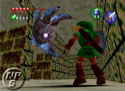
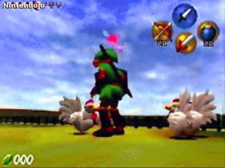
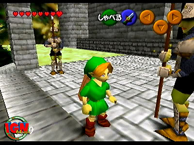
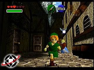
This era saw some major changes to the interface design.  For starters, the A button now could only have the sword equipped.  Also, the backgrounds for the buttons became much plainer, no longer using the gradient design that they had used for every previous version (perhaps because it was around this time that they realized they would be using a regular cartridge and not a disk).  The B button was a bit more intelligent now, capable of displaying many more commands (though it still required Navi's command if it couldn't show anything else).  Many more items were added to Link's arsenal as well, but the medallions could no longer be equipped.


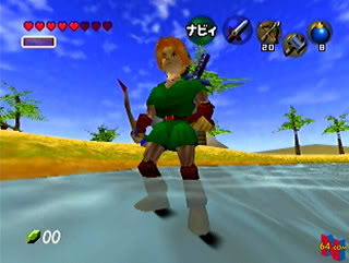
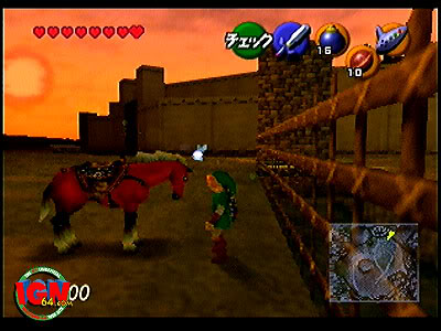
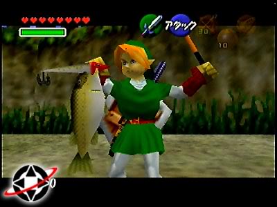
Lots of interesting stuff happens with the interface at this point, most of it similar to the final version of the game.  For starters, we now have the mini-map, although we see several different kinds.  There's the topographical map in the upper-lefthand screenshot, the flat, labeled map in the upper-right, and a map more like our own in the lower-right (though it's probably just a very 
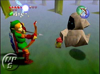
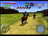
uninteresting topographical map).  Also, we see two-digit rupee counters, different rupee counts (00, 150, and 110), no ammunition counter for the slingshot in the upper-right, and the carrot counter for horses.  Also of interest is the timer and the English text.
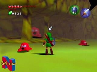
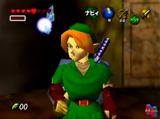
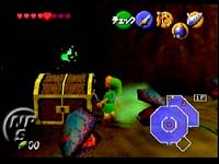
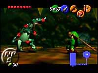
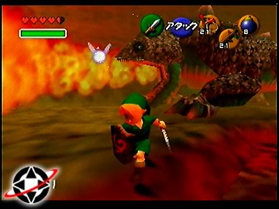
Something a little unusual was Navi's many different colors.  With enemies, Navi turned red.  Characters made her turn yellow, objects of interest were green.  Before, she also turned into magenta.  Of course, this scheme actually lasted for a long time, and so during this time the targeting markers weren't the spinning yellow arrows we're used to, but spinning red brackets.


Also, we finally got a glimpse of text boxes in the game, though for a short while they were very different.


Original Textbox

Later Version

This design was used for most of the game's development.  As it drew close to release time, they decided to change things yet again, although this change was fairly simple: swap the A and B buttons.  All of the screenshots from that point on reflected this switch, which occurred somewhere during the translation phase.  The Kokiri Sword icon was also edited to have a red gem instead of a green one.


There wasn't much left to change.  Oh, except that they redid all of Navi's colors and turned the brackets into triangles.  But it's probably for the best; those brackets weren't that great anyway.


BACK